I tried to paint Buckethead in gouache on the page with Reggie and Daft Punk but it didn't turn out quite how I wanted. I think I might want to do another layer over it but I may not get the chance realistically...
I did an ink and marker piece of the singer/guitarist of Gogol Bordello...gypsy...then Borat is hiding on the bottom of the next page.
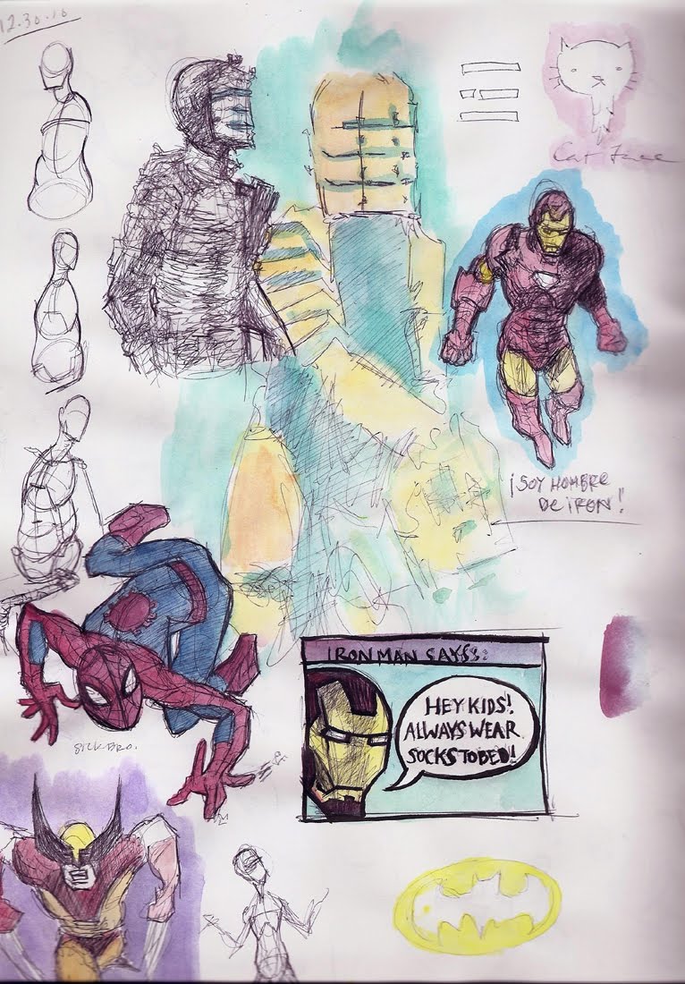
I did some Michael Hampton studies and a few sketches and I have been coloring those for fun.
During Week 2, I went down to the Lifedrawing Workshop but I felt totally sick so I only had the time/strength to fill one page.
The next day I tried to draw some more during a class, but my head was still bothering me so it felt unusual.
I watched a cool video at theartcenter.blogspot and it inspired me to do some made up ink/marker stuff. I attempted a master copy of Sargent's Rosina in oils. That was weird...I learned a lot though.
Then there are some Bridgman studies, Vilppu studies, lots of sketches and a little marker mess based off of the Mars Volta poster/album cover.>
YO. Here is a bunch of stuff that's been going on in my head lately. I got some dope books from my brother for Christmas so I have been doing plenty of Michael Hampton studies and even drawing up some superheroes for fun.
In other news, I have to create the poster for the next Sketchbook Battle since I was the winner last quarter and I was playing around with some ideas in photoshop...A lot of them weren't working. I ended up with a decent success and I sent it to Kevin but I haven't gotten a response yet. I feel like it was my first time designing a POSTER (not a FLYER) that is going to be printed nice and it really has to get the message across since people can be easily confused by the rules...
If you can't tell, the actual DESIGN and typography layout IS loosely based off of Brandon Lin's because I thought about eye-catching colors and simple design and when I looked at his poster, he had already solved many design issues I was going to face.
I thought, what is the loudest color, like yellow, or red...and he already mixed em up! I had my piece and was like...hmm there's still some space on the top and bottom...well if the title has it's own label it solves that too. So holy shit. WELL he did win like 2 or 3 times so that's plenty of posters to design, I'm sure it only gets easier. Anyways...let me know what you think if you will. Peace.